LIFELOCK
Member Portal Redesign, mobile and web
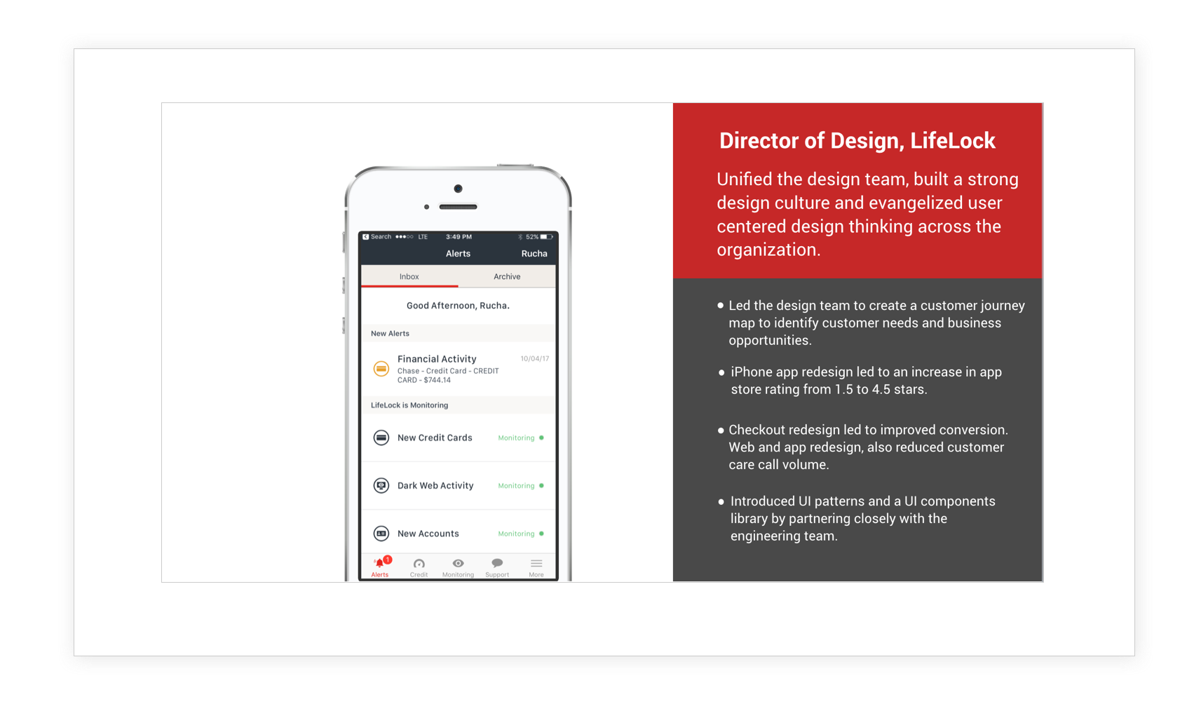
ROLE
Director of Design
DATE
March 2017
LifeLock provides a subscription service to protect individuals from identity theft. If a LifeLock member becomes a victim of identity theft, LifeLock will spend up to $1 Million to recover and restore their identity.
I partnered closely with the engineering and product teams to plan the product roadmap and drive product and design strategy. I brought increased focus to design quality by emphasizing user research and following consistent standards for content strategy.
CUSTOMER PROBLEM – MEMBER PORTAL
Users were unable to complete tasks in the member portal as the information architecture was confusing. They would call customer support to resolve issues.
DESIGN CHALLENGE
There was a huge opportunity to deliver an intuitive and seamless experience to increase task completion. The engineering team was also moving to a new stack and this added more complexity to the overall project. In addition, LifeLock products lacked a unified look and feel from a brand standpoint, as part of the redesign we introduced new brand guidelines.
I led the team to conduct research on concepts, set the vision and strategy for the redesign of member portal mobile and web flows at LifeLock. The redesigns incorporated the newly introduced UI patterns as well.

RESEARCH AND DESIGN PROCESS
Conducted IA and tree jack exercises to arrive at the right IA. Based on findings, frequently used functionality was made easy to find, conducted concept testing and iterated on final designs that was a more intuitive information architecture and easy to use.

Final designs – As part of the redesign we introduced an onboarding flow for quicker set-up. A simple and intuitive IA navigation increased member engagement.
Success metrics - Members were adding more information for profile completion, also completing tasks more frequently.

CUSTOMER PROBLEM – ENROLLMENT
Customers were dropping off before completion of checkout due to the amount of information they had to provide to buy the service.
DESIGN CHALLENGE
As a product with multiple channels to enroll customers, there was a need to have a 30,000 ft view of the various touchpoints in order to increase enrollment and reduce cancelation and create a simplified checkout experience.
RESEARCH AND DESIGN PROCESS – I led the team to develop a comprehensive journey map of the customer touchpoints for online and phone enrollment. The team conducted user research and implemented design changes based on qualitative and quantitative insights.
Final designs – Introduced a clear step flow and progressive disclosure to reduce cognitive load. The redesign also reduced the amount of required information to complete the process of checkout. The team also introduced new brand guidelines via the redesign.
Success metrics
The redesign of the enrollment form led to a decrease in completion time and an increase in completion rate.

UI PATTERNS LIBRARY
I identified the need for a consistent UI across the company’s products. I led an effort with the design team to create LifeLock’s first UI patterns library, which has been implemented across the redesign of all key flows. In addition, I collaborated with engineering leadership to build reusable UI components to introduce time savings in the build process.